


Use
Users should utilize Data Visualizations to explore aggregated data, which is available in various visual formats such as charts, graphs, and tables. However, when needing a comprehensive list of client records that displays one row per household, member, or visit—complete with client-specific information—Users should continue to utilize Dynamic Reports.
System Location
- Open the Reporting tab.
- Select “Data Visualizations”.


Controls
Each Data Visualization has a set of filters - named CONTROLS - to help the user narrow down their desired data. These controls are located directly below the "Pick a Report" field.
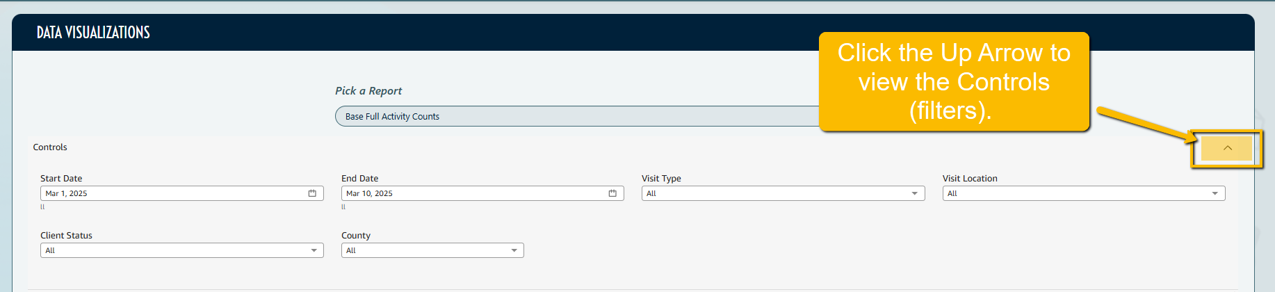
These controls can be changed to make the Data Visualization reflect different date ranges and other filters unique to each report.
Out-of-the-Box Reports
The Data Visualization feature comes with the following pre-built reports that allow users to get started right away:
1. Full Activity Counts:
-
-
This aggregate report provides insights into the total visit/service/distribution activity within the dataset.
- This report will reflect the answers a client gave on the most recent registration/visit/demographic prior to their visit.
- This Visualization has the following set of filters - named CONTROLS - to help the user access the desired data. These are located directly below the “Pick A Report” Field
-
-
- Date Range
- Client Status
- Visit Type
- Visit Location
-
-
- This Visualization also has a "Table Counts Only" tab, which displays aggregated data in a line-by-line view without the visual representations of the data in a chart or graph form.
-
To access: Open the Reporting tab, select Data Visualizations, select the report type "Base Full Activity Counts", select the "Table Counts Only" tab.

-
-
-
-
This report provides an overview of all the client data currently in the organization's system. It is most useful for gaining a comprehensive understanding of your organization's client base.
- This report will reflect the most recent answers a client has given to registration and custom questions.
- At the top of the report, you can see data visualizations for clients by postal code, gender, city, and relationship.
- Under the Custom Questions section (Note that there is a section for Registration, Demographic and Interview Questions), you have three visual options:
-
-
- A bar graph
- A pie chart
- Table View
-
-
-
Please note: You will still need to access your Dynamic Report “All Client Records” for a list of all client records that provides one row per household.
-
-
This Visualization has the following set of filters - named CONTROLS - to help the user access the desired data. These are located directly below the “Pick A Report” Field
-
-
-
-
-
-
Client Status
-
Relationship to Primary
-
Gender
- Country
- City
- Adult Minimum Age (used to customize age groups on the visualization)
- Adult Maximum Age (used to customize age groups on the visualization)
-
-
-
-
-
-
This report provides an overview of all inventory item transactions for a time period: received, distributed, adjusted, and trashed
- At the top of the report, you can see quantity of items distributed, value of items distributed, quantity of items received, and value of items received.
- Additional visualizations break down poundage and quantity trashed by location, quantity trashed by item type, sum of adjustments by item, and sum of adjustments by item type.
- This Visualization has the following set of filters - named CONTROLS - to help the user access the desired data. These are located directly below the “Pick A Report” Field
-
-
- Date Range
- Location
- Item Type
- Item
-
-
-
4. Inventory Receives:
-
-
This report provides an overview of all inventory receives for a time period.
- At the top of the report, you can see quantity of items received, total value of items received, total weight of items received, and number of unique items received.
- Additional visualization break down quantity received by location, quantity and total value by item type received, quantity received by item, and quantity and value of items received by source.
- This Visualization has the following set of filters - named CONTROLS - to help the user access the desired data. These are located directly below the “Pick A Report” Field
-
-
-
Date Range
- Location
- Source
- Source Type
- Item
- Item Type
-
-
-
-
5. Item Distributions:
-
-
This report provides an overview of all inventory items distributed (added to a client's visit) for a time period.
- At the top of the report, you can see total pounds of distributed items, total quantity of distributed items, total value of distributed items, and number of unique clients distributed to.
- Additional visualization break down quantity of distributions by item type/item, dollar value by item type/item distributed, dollar value by item type/item distributed, and distribution breakdowns by item type/item.
- This Visualization has the following set of filters - named CONTROLS - to help the user access the desired data. These are located directly below the “Pick A Report” Field
-
-
-
Date Range
- Location
- Visit Type
-
Item
- Item Type
- Item Group
-
-
-
-
Data Terminology
- “Unique” vs. “Unduplicated”
-
-
- In PantrySoft, there is no difference between the two. "Unique" and “Unduplicated” counts both refer to each client being counted once, no matter how many times they visited in the date range.
-
- "Total" vs. "Duplicated"
-
- In PantrySoft, there is no difference between the two. "Total" and "Duplicated" counts both refer to each client being counted as many times as they visited in that date range.
-
- “Household” vs. “Client”
-
-
- Within PantrySoft, "Household" and "Client” or “Client Record" are the same thing, often used interchangeably.
- The name that gets tied to that Household/Client Record is whoever is identified as the Primary Household Member/Head of Household at the time of creation in PantrySoft.
-
- “Client”/”Household” vs. “Household Member”?
-
- A “Client/Household” is the name of the Primary Household Member or Head of Household who represents the entire household.
- A “Household Member” is any individual member of the household/client record.
-
Exporting Data
- Entire Data Visualization Screen: You can export a downloadable and printable PDF of the entire data visualization screen. To do this you will set the appropriate filters via the control panel and click the download icon positioned on the top right of the control panel.
The following image demonstrates the position of the export button:
The following is a zoomed in picture of the export icon:
- Individual Data Sets: You can export a data set by clicking on the three vertical dots in the top right corner:

Next, select the Export to CSV option:

In the future, Users will be able to print a PDF version of the Data Visualizations. In the meantime, users can make use of their go-to screen capture tool to export an image of the Data Visualization Charts.
Additional Menu Options
Two more functions of the menu options in each section include Maximize Screen and Applied Filters.
Maximize Screen provides a much larger view of a specific chart. To open the Maximize Screen view, click the arrows pointing outward. To exit that view, click the arrows that are now pointing inward.

Applied Filters: Users SHOULD NOT manipulate the Applied Filters on any given chart, as some adjustments require advanced technical support to reverse. If a different set of data controls is desired, please adjust those at the top of the entire Data Visualizations Screen.

Custom Work & Pricing
For clients who require additional customization or more specialized data views, custom dashboards will be made available in the order the request is received. These customizations can include pre-set visualizations that do not require manual filtering by Users and sometimes compare multiple data points against one another, for example, gender and race within one visualization.
Pricing: Pricing for Custom Visualizations will include a set-up fee and, in many cases, a monthly maintenance fee added to the organization's subscriptions.
Timeline: Please allow a turnaround time of three months for these Custom Reports to be built by our Data team.
Please contact the team with additional information regarding your custom Data Visualization request using the form found here.
Data Refresh Schedule
Data Visualizations are on a Refresh Schedule, which means that - unlike Dynamic Reports, which pull data in real-time - they pull data once a day.
When you view a date range that includes the current day of data entry, or if you update historical data, you will observe differences between your Dynamic Reports and your Data Visualizations. These discrepancies will be addressed and corrected during the nightly refresh of the Data Visualizations.
Data Visualizations and Aggregate Reports
Data Visualizations will replace the current Aggregate Reporting tool within PantrySoft altogether on June 12, 2025. The three-month overlap window is meant to give users the time they need to feel confident accessing aggregated data using the new tool.
During the three-month overlap, Users may notice data discrepancies between Aggregate Reports and Data Visualizations. One reason for this discrepancy is the drift on dates as a result of time zone differences. That, combined with the inability to see and control the data queries behind the aggregate reports, provided impetus for the switch. If you notice a discrepancy, defer to the data on the Data Visualizations and Dynamic Reports.
Additional Information: How Data Visualizations Work
Under the hood, dynamic reports run extensive queries to generate a full dataset. Instead of restricting data to specific ranges, such as “Visits in Range” with a selected date range, the system pulls an exhaustive dataset, capturing everything in the past 24 months. This comprehensive query ensures that all data points are available for analysis.
Once the data is retrieved, Data Visualizations slices and presents it into digestible visualizations. This allows users to interact with the data by adjusting filters and changing what they see in real-time.
For more complex or specific data sets, the PantrySoft Data team can perform additional queries. This is a paid professional service. Please see Custom Work & Pricing above.
For additional details or questions, please contact our support team using the form at this link or emailing support@pantrysoft.com.